

In case you missed the news, LinkedIn has a new iphone app and some . . . interesting ideas about how it wants to use your data. Stephen gave us the ... More

The Call-to-Action – Its Importance and How You Can Develop Yours
Although most small businesses are now investing more in web marketing over traditional avenues like the YellowPages, most are still missing a ... More

Top 5 Excuses For Avoiding SEO and Why You Should Stop Using Them
Small businesses may neglect SEO for a number of reasons, in most cases misguided. We’ve heard all the excuses over the years. None of them hold ... More
Long vs. Short Copy – A Classic Copywriter Dilemma
Recently, I had the pleasure of watching a webinar from Marketing Experiments (ME) entitled “Long Copy vs. Short Copy – How Discovering the Optimal ... More
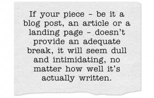
Copywriting and White Space – Making Readable Web Content
If you’re a company trying to build an online presence, you’ve certainly heard how important developing content is. Blog posts, buying guides and ... More

Infographics – A New Frontier or Too Much at Once?
Unless you’re completely new to developing SEO optimized content, or have been living under a rock for the last couple of years, you’ve certainly ... More
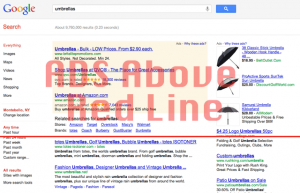
Keeping your Content Above the Fold and Easy to Find
All the way back at the beginning of 2012, Google rolled out a new page layout algorithm. This October, the search giant provided an update on the ... More
SEO and PPC – Which is Better?
Businesses just starting to wade into the waters of online marketing often ask which channel is better – should I focus on search engine ... More

Is SEO and Usability Separable or Inseparable?
As a search engine optimization company specializing in helping businesses dominate their respective industries online, we spend a lot of time ... More