Last updated on September 6th, 2017

Although most small businesses are now investing more in web marketing over traditional avenues like the YellowPages, most are still missing a critical component on their websites – the call-to-action.
What can be included in a call to action?
A call-to-action can include:
- Specials
- E-mail newsletter signups
- How-to guides downloads
- Demos
- Interactive tools
- Contact information
To be clear, the CTA doesn’t always need to immediately convert a visitor into a customer. If your offer is rather complex and expensive for example, you don’t exactly want to jump right out and say “BUY NOW.”
One way to think about it is meeting a girl in a bar – you’re not going to walk up to her and immediately say “let’s go back to my place shall we”. If you do, you’ll at best be met with a cold stare, and at worst, a slap across your face – unless you’re a real smooth operator J
Therefore, a “Buy Now” type CTA shouldn’t always be your first choice. The type of CTA you end up using depends a lot on the type of content and where your prospect is in the sales process – often times, your CTA should involve an invitation to learn more, either through a link to other resources on your site, or an invitation to download a how-to guide or white paper in exchange for an email address.
Who should use a call to action?
An alarmingly high number of companies are not including a proper CTA on their homepages, landing pages and site content
According to a recent study by Online Marketing Coach and Small Business Trends evaluating over 200 U.S.-based small businesses, over 70% do not display a clear call-to-action, or CTA, on their homepage. While nearly all sites had a CTA of some sort, namely a “contact us” or email/phone link, over 2/3 simply failed to deliver a good value proposition.
This is an astounding number considering how critical a CTA is – after all, you need to at least give your site’s visitors direction on how they can stay engaged with your firm.
A few other observations from the study:
- 96% do not have any sort of how-to guide or white paper on their homepage
- 72% do not have any call-to-action on interior site pages
- 82% do not reference social media profiles
- 27% do not include a phone number on their homepage
- 70% of sites with a phone number do not display it prominently
- 68% do not include an email address on their homepages
- 38% of sites with an email bury it on their homepage
Methods of incorporating calls to action in your page
Yikes, now that you mention it, my site’s call-to-actions are pretty slim, and even nonexistent. What can I do?
We can indeed concur with many of the study’s findings – the call-to-action is one of the first things that jump out at us most of the time.
Fortunately, these issues can be addressed…
It’s important to remember that all types of content need to have a call-to-action of some sorts. Like we explain above, this can consist of something as simple as inviting the reader to visit your company’s blog and/or knowledge center or signing up for a free e-newsletter.
CTA’s can also be as simple as a hyperlink weaved into your copy to a more colorful, and noticeable, custom button or banner.
It really depends on the page and the point your visitor is in the sales cycle.
Call to action examples
In researching how to best approach a call-to-action, we found several insightful tips from both CMI and Marketing Experiments. Below are general, yet rigorous guidelines you should consider when developing CTA’s:
For CTA’s in your copy, make them specific, tout benefits and use keywords. According to Maggie Georgieva of HubSpot, the Internet is full of “vague information” and that by “…using exact language with the audience, they’re [visitors] more willing to invest the time.”
So if you’re trying to get the visitor to sign up for your e-newsletter, you might say “Stay Up-to-Date on Industry News.” Or if you’re selling a product for example, talk up its benefit. “Save Time When Getting Ready in the Morning” or “Click Here to Begin Saving Hard-Earned Money” are good examples of CTA language.
Buttons and banners should “stand out through contrasting colors,” but other factors like brand-appropriate colors or using a recognizable custom icon to pair with CTA’s are more important according to CMI.
Another big factor is user-friendliness. If the visitor clicks your CTA, you’ll want to be sure they can easily navigate everything from start to finish. Doing so will ensure more visitors will complete the desired action.
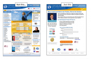
Assumed vs. direct value – if you’re working with a sales page, you should also tell your visitors “why” they should take a requested action. One example from a Marketing Experiments (ME) study shows a before and after – the first landing page’s CTA simply says “Next” while the second one uses “Get your Free Consultation” for its CTA.
The second CTA more clearly identifies what value the visitor will see when they click the link. This is why the 2nd page in ME’s example experienced an astounding 357% increase in conversions!!
Understand where your visitors are at in their thought sequence. If your landing page is for a house, simply saying “Buy Now” is premature. Like we said before, you want to be sure you’re pairing your CTA with where the visitor is at. For our house example, a more effective CTA may be “Tour this home” or “Take a Virtual Tour Today.”
For direct offers, be sure you’re including a level of authentic urgency. Words like “Act Now” have been so abused by marketers they’ve been rendered meaningless. However, a CTA like “The first 100 customers will receive 50% off” will provide a sense of urgency, which may motivate the visitor to act.
Positioning – there are several places you can insert a CTA. Newsletter signups for example may be included in the right or left navigation on all pages. Some marketers say it’s best to place your most important CTA’s in the top-right corner of your page, above the fold. CMI also suggest other places you can insert a CTA, including:
- At the end of an article
- Within the piece (…just be sure it doesn’t interrupt the flow)
- Right sidebar
- Top banner
Again, these guidelines are very general nature, but provide a good framework for how you should develop CTA’s for your webpage.
Most pages on your site should include a call-to-action of some sorts – blog posts can be relatively simple, while sales/landing pages will require a bit more finessing.
If you want to learn more about the call-to-action and if your site is using them properly, feel free to call search marketing experts at SEO Advantage for a consultation.


