

Best practices for choosing a blog post image that connects, compels and captivates your audience If a picture is worth a thousand words, then ... More
SEO Roundup: April 17, 2015
Mobilegeddon. It’s coming and it’s inevitable. Are you ready? Like a shiver that runs down your spine, the term “mobilegeddon” has been creeping into ... More

5 Lessons to Take Away from Eye-Tracking Studies
For marketers concerned that their web content is not performing to its maximum potential, eye-tracking software and heat maps can tell you where your ... More

Free or Low Cost Images That Instantly Make Your Content Irresistible
Creating unique content your website or blog is a challenge. Finding the right image to accompany the content—ever more so. And let’s face the ... More

Infographics – A New Frontier or Too Much at Once?
Unless you’re completely new to developing SEO optimized content, or have been living under a rock for the last couple of years, you’ve certainly ... More
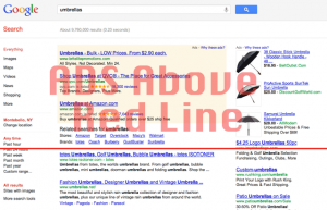
Keeping your Content Above the Fold and Easy to Find
All the way back at the beginning of 2012, Google rolled out a new page layout algorithm. This October, the search giant provided an update on the ... More
Why Mobile Sites Have to Be Simple
Just about every day, a new technological innovation hits the market – at least it seems to anyway. One area that’s experienced rapid growth in recent ... More
10 Important Points to Consider when Redesigning your Website
Every so often, your website should undergo a face lift. It’s important to consider a site redesign every couple of years or so to maintain a fresh ... More

3 Types of ‘Breadcrumbs’ – And Why You Should Include Them on Your Site
Breadcrumbs – and no I don’t mean the ones you use when frying something – is a term I recently became re-acquainted with. While not an absolute ... More