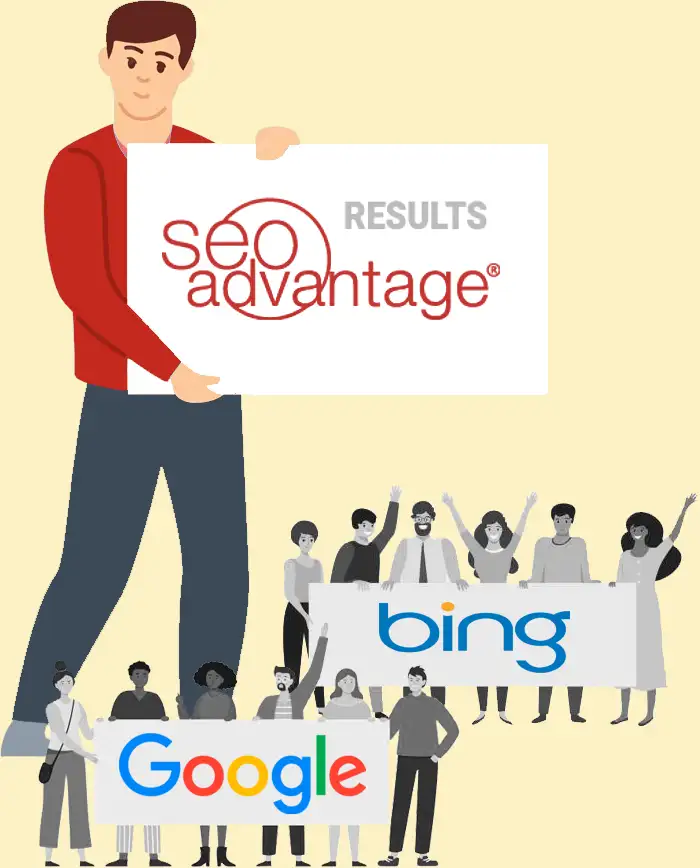
Is your company getting results like these?
Our clients have, for more than 25 years
Is SEO Misunderstood? Yes. Overpromised by less-than-honest sales tactics? Certainly.
However, the most critical issue is the lack of proper integration of SEO into new websites. Why? Typically, it’s because many web design agencies do not specialize in SEO, a fact often unknown to their clients. In many cases, these agencies might not fully recognize this limitation, as their primary focus is design rather than SEO.
You’ve likely seen SEO as just another item to check off when hiring a web design company.
It appears effortless and affordable, doesn’t it? You might have even selected it as an add-on during domain registration or opted for it through a digital marketing giant that claims to “do it all.”
Does that describe your experience so far?
Here’s what we know. We know you’re a business owner or are tasked with growing an online business. If you’re here looking at SEO Advantage, you are probably in one of these two categories.
One:
Looking to design or redesign
with SEO in mind.
You are looking for a web designer or design agency to create or re-design your existing site. In this case, you’re looking for a blend of aesthetics and functionality, with a keen eye on how well it’s optimized for search engines.
Are you sure that the web design agency you’re about to hire to build your site knows how to optimize it?
Are they SEO-aware?
Because the truth is, many don’t.
Two:
Disappointed by your current
“SEO Agency.”
You were misled or scammed by “SEO Agencies.” You thought your website was optimized, only to discover it wasn’t, as it barely has any relevant rankings or traffic. You see your competitors ranking, but you do not.
Are you worried about getting scammed by SEO agencies again?
Many agencies overpromise and underdeliver. You deserve better.
In both scenarios, you recognize that online visibility matters. That’s why you want a savvy website that ranks on page 1 of Google and across all major search engines. And you’re absolutely right. Visibility is power. Branding is power. Getting top Google rankings without paying through the nose for pay-per-click is power.
Digital marketing without SEO?
That’s not truly digital marketing.
Search engine optimization is the silent engine driving successful online businesses. Every company that secures a spot in Google’s top rankings—be it in Local Maps listings, Google Shopping, News, Discover, or elsewhere—benefits significantly.
Without strategic SEO built into the foundation of your website and a consistent effort to maintain and improve your rankings, how will you generate site traffic and leads?
We optimize and grow businesses through SEO, integrating custom optimization into every aspect of our client’s online presence. This includes rebranding efforts, design choices, content creation, and every digital marketing campaign.
Make SEO your highest priority before starting a website, hiring a design agency, redesigning, or launching your new brand.
“No one sees a fancy billboard in the middle of nowhere.” That was an old saying about why every website needs to be optimized. So before you sign on the dotted line, ask yourself:
- Does your design agency understand how to drive qualified traffic through organic rankings? If they claim to do SEO, can they show a proven track record of bringing businesses to the top of search results?
- Is SEO an afterthought in their proposals? Do they treat it like a checkbox rather than the fundamental building block of your online presence?
Why hire SEO Advantage
SEO is the core of our expertise.
Our dedicated team is committed to creating web designs that are visually appealing and rank well in search results. We’re all about making websites that stand out and perform well online.
We help digital marketers and design agencies do SEO.
We’ve collaborated with several outstanding design and digital agencies, helping them ensure that their clients’ sites are both savvy and rank-worthy or have a solid foundation for future ranking. We can recommend design agencies we trust and have worked with successfully (just ask us).
We fix websites scammed by drive-by SEOs.
If you’ve been burned by other ‘SEO agencies,’ we’re glad you’ve found us. We specialize in fixing past SEO mistakes, restoring rankings, and growing your business.
Forget those who have tried to convince you that SEO is dead.
It’s very much alive, and with our help, your website will be, too.
Whether you’ve been burned by other SEO agencies or simply want to refresh your website, we’ve got you covered.
We’re selective about our clients. Tell us about yourself. We’ll see if you are a good fit and can benefit from our work.
Our Search Engine Marketing Services
Core Site Optimization
Let’s kick things off with your current website. We’ll review your site’s content, structure, quality and optimization. From there, we’ll come up with a solid plan to spruce it up and get it running at peak performance.
Local SEO
Outrank your competitors in Google Maps and beyond. We optimize your business’s online presence to maximize its visibility in localized search results, covering Google’s Maps, organic listings, and other search engines.
Mobile Responsive Design
Our custom approach ensures your site not only appeals to your visitors, driving conversions, but is also optimized across all devices for maximum visibility.
Website Copywriting
Let our skilled team of marketers, copywriters and content strategists give your business a voice and make it an industry leader in search engine rankings.
Premium Content Marketing
All content is not created equal. Premium content, coupled with outreach to attract links and mentions, builds authority and grows rankings, making a significant difference for your website’s visibility.
Social Media Marketing
Are your customers sharing content on Twitter or Facebook? Pinning photos to Pinterest? Building professional relationships on LinkedIn? The social media world is much larger than it once was, and the time of one-size-fits-all social media plans has long passed.
Local SEO for Key Industries
Attorney Local SEO
You’re a top-notch attorney, and your firm is the best at what you do. You know it and so do we – but what about your prospective clients? Can they find you on Page 1?
Healthcare SEO
Every day, in every town, people seeking medical care use search engines to find top local health providers—be it general practitioners, pediatricians, or cosmetic surgeons. Are they finding you in their search for the best care?
Nonprofit SEO
Enhance your online marketing with our tailored search engine optimization strategy. Attract a larger donor base and elevate your fundraising efforts.

Exclusive attorney marketing for Workers’ Injury Law & Advocacy Group (WILG)
SEO Advantage is honored to serve as the exclusive search engine optimization partner for WILG, a distinguished work injury attorney organization. Our services encompass consultation, local SEO, and collaboration with your existing SEO agency to create a tailored content partnership.
Proven SEO strategies that have powered our clients’ success
We are ready to do the same for you.
Core Website Optimization
We engage with our clients to tailor solutions for comprehensive website analysis and optimization. What’s the health of your website? How does it rank? Are you using relevant keywords? How is your website traffic and does it convert? What’s stopping you from achieving those high rankings and conversions?
We’ll analyze and find out.
Local SEO
Search engine results are driven by intent. Does your website signal local intent to prompt Google to rank it in Maps or organic listings? If not, let’s have a conversation to address these issues.
We’ll address any challenges that are keeping you from ranking locally.
Technical SEO
How optimized is your page speed? Is your site hierarchy logical? Are there redirect chains that could affect your site’s performance? (Believe us, we’ve seen sites tank because of this.) Regarding your WordPress plugins, how many do you actually need?
We master all the essential, technical maneuvers behind the scenes to ensure search engine optimization works effectively for you.
Premium Landing Pages
How is your landing page performing? Is the content quality up to par? Do you have pages supporting your keywords? Are there additional pages that demonstrate your expertise?
We’ll brainstorm to get all the information and optimize your landing page for a lasting impact.
Search-Friendly Web Design
Do users struggle to find information on your website? Why is that? Where are your calls-to-action, and do they make sense?
We can find the pain points and enhance user experience to create a user-friendly design that moves your prospects toward conversions.
Link Building
What efforts have you made to build your website’s authority? Did you hire someone to build your backlinks for, say, $20? How do you perceive earning backlinks?
We’ll work out a sustainable approach to earning high-quality backlinks.
Quite often, we find a disparity between what people perceive SEO to be and what it actually is. We make sure that our clients align their expectations and understand that SEO is not a quick fix.
Digital marketing is a broad spectrum, and SEO is only a part of it.
We started our web optimization business before Google was born.
Not many SEO companies can claim that.
As one of the few industry veterans, we boast over 25+ years of individual experience in working with and ranking websites. Our clients have been with us for over a decade, a testament to our expertise that few other SEO companies can match.
Unlike “drive-by” SEO agencies, we commit to your success for the long haul. We’re not here to take your money and move on; we genuinely invest in your growth and stand by our work.
We’re happy to provide references whom you can contact to hear firsthand about their experiences with us.
In the first 14 months of our partnership with SEO Advantage®, our firm has won over 400 page 1 rankings and takes the #1 spot globally for ‘copper bullion,’ beating out an impressive 4.8 million competing listings!”
Joe Merrick
Provident Metals
Some of my competitors are paying 150% of what I’m paying for the same level of service, but sometimes not for the same level of success that I’m receiving. I consider myself lucky to be working with them.”
Mack Babcock
The Babcock Law Firm
Within our first quarter as a SEOAdvantage client, MaxFilings saw a 49% rise in referral traffic compared to the previous quarter. By month 4, the number of conversions had doubled compared to the month prior to beginning.”
Jim Reuning
MaxFilings

Page 1 is where revenue lives.
Do you look past the first page of search results? No one else does, either. Our SEO techniques push your website to the top, increasing rankings and traffic.

Your website is the online face of your business.
First impressions matter. Getting visitors here was just the first step. A top-notch design means they’ll stay longer and come back more often.
Visitors are great, but customers are better.
Now that your rankings and traffic are up, we make sure those visitors will want to contact, sign-up, like, or purchase their way through your website.
That’s the point, isn’t it?
You want your website to grow revenue for your company. Our formula has helped businesses in a range of industries reach that goal for over 25 years.
25+ Years of Delivering The SEO Advantage


Our team of SEO, marketing and content experts possess decades of experience and are skilled, educated and certified in multiple disciplines. We employ a 360° approach, working from every angle to build a website that helps you meet your goals and grow your revenue.
High-Impact SEO: Optimization for a personal injury website
Enjuris, powered by the proficient SEO strategies of SEO Advantage, Inc., is a leading resource for personal injury victims. The platform aims to demystify the legal landscape, providing critical knowledge about compensation rights and fostering connections with expert attorneys across states.
Our strong SEO impact has driven Enjuris to the top, earning #1 rankings in search engine results—a testament to the high-quality content and excellence that SEO Advantage, Inc. consistently delivers.
With over 70,000+ ranking keywords, our expansive reach enables users to easily access our information-rich and authoritative content.
The screenshots below highlight a sample of our numerous #1 rankings, visualizing the tangible impact of our SEO efforts. Together, Enjuris and SEO Advantage, Inc. are ensuring that individuals facing personal injury legal issues can find comprehensive assistance at their fingertips.


Our experts have partnered with hundreds of businesses on thousands of projects to deliver top results out of millions of searches.
Our clients keep coming back for more, and many have worked with us for several years, enjoying continued website growth.
We deliver innovative, attractive and responsive web designs using the latest SEO techniques for improved rankings and traffic.
For over two decades, we have helped customers and businesses all around the country solve their Internet marketing challenges.
Our SEO team boasts a median experience level of nearly two decades, which serves an endless pool of knowledge and foresight.
With a decade of creative knowledge at their disposal, our team builds custom sites that inspire, innovate and equip businesses.