

Okay folks, here’s the reality for anyone who needs to hear this: Website accessibility has to be an important part of your website design strategy if ... More

Making a Beautiful Infographic is as Easy as 1-2-3
Infographics are an extremely effective way of sharing information. In fact, according to this article on CoSchedule, “Infographics are 30 times more ... More
AdSense User Loses $46,000 to Google Punishment
Idris Sami, 19, is a French-Moroccan entrepreneur who created a website called MesTextos that allows French-speakers to text for free. It’s a great ... More

5 Lessons to Take Away from Eye-Tracking Studies
For marketers concerned that their web content is not performing to its maximum potential, eye-tracking software and heat maps can tell you where your ... More

Google Search Results Warn Smartphone Users of Faulty Redirects
In today’s competitive market, your website must be mobile optimized to stay ahead of competitors. Google Webmaster Trend Analyst Mariya Moeva wrote a ... More

Interview With a Leading SEO Expert About Legal Marketing Solutions
Recently, I had the pleasure of interviewing Wes Reunig, Sales Director and Executive Vice President at SEO Advantage (SEOA). Wes and his brother ... More

Why Your Website Is Not Making Money
Location, location, location… it’s vital for brick-and-mortar storefronts and online businesses. It takes a lot of online marketing muscle and search ... More
The Importance of Hiring the Right SEO Expert
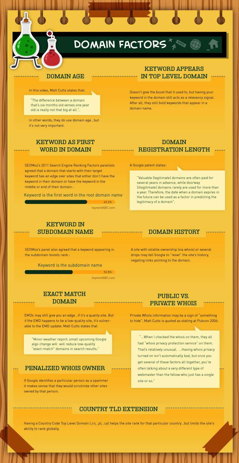
200 Things Google Looks For When Ranking Your Page (Infographic)
Did you know that Google might rank your website lower than others if you don't register your domain name for longer than a year? Were you aware that ... More

Infographics – A New Frontier or Too Much at Once?
Unless you’re completely new to developing SEO optimized content, or have been living under a rock for the last couple of years, you’ve certainly ... More