Friday Trivia: Social Network Usage

Welcome to SEO Advantage’s Friday Trivia feature, where we discuss, dissect and comment on the internet and marketing, and how the two intertwine.

PEW Internet has just released their 2012 statistics for social network usage. You should definitely check out the expanded demographics, but first, see if you can guess which networks are used the most among adults. Some of the answers may surprise you.

Instagram is new, but growing.

Lunch is just one of many photo opportunities for Instagram users.

Question:Can you put these social networks in order based on overall usage?

Instagram
Tumblr
Facebook
Twitter
Pinterest
LinkedIn

Answer:

Facebook – Unsurprisingly, Facebook is the biggest social network there is. A whopping 67% of adults surveyed reported using Facebook. That usage is 47% higher than the next network on the list.

Facebook appeals to consumers and businesses of all sizes. There’s not a person or organization in the world that can’t get some sort of benefit from Facebook , and for businesses, the opportunities to build real relationships with consumers are countless.

LinkedIn – At the number two spot – with 20% usage among adults surveyed – we find LinkedIn. This placement might be surprising to some, but when you think about it, business connections often overlap with social and friend connections.

Additionally, LinkedIn is useful for building business and career contacts in just about any industry. It serves as an online resume for job seekers and a way to share knowledge among peers in a given field. While LinkedIn is certainly a niche network, that niche is larger than many realize.

Twitter – The main surprise here is probably that Twitter – with 16% usage among adults – didn’t beat out LinkedIn for the number two spot. There are likely a few reasons for this, but I suspect the growing number of businesspeople who are discovering the benefits of online professional networks plays a part.

Pinterest – That’s right! Pinterest, which has only been around since March of 2010, is a relative newcomer to the social networking scene, yet it is already used by 15% of adults. It may only be a matter of time before Pinterest eclipses Twitter. The lesson here for online marketers? Bite-sized, visual content absolutely must be part of your strategy.

Instagram – Another newcomer, Instagram launched in October of 2010 and made an immediate beeline for social media prevalence. Pew’s reported usage is 13%. What does this tell us?

For one, we are in a mobile age, and Instagram is a mobile platform. Secondly, Instagram is the epitome of visual content sharing, and thirdly . . . people really love sharing photos of their cats, their meals, and themselves in front of mirrors.

Tumblr – Tumblr has been around since April of 2007, and can probably take at least partial credit for the move to more snackable content. Even with that being the case, only 6% of adults surveyed report using Tumblr.

So, how did you do?

Did you guess that LinkedIn was more popular with adults than Twitter? How about Pinterest coming so close to the number three spot? Did you see that one coming? Let us know in the comments!

*Above photo by Ari Helminen (Flickr: Instagram, Tokyo Japan) [CC-BY-2.0 (http://creativecommons.org/licenses/by/2.0)], via Wikimedia Commons
 

Keeping your Content Above the Fold and Easy to Find

All the way back at the beginning of 2012, Google rolled out a new page layout algorithm. This October, the search giant provided an update on the algorithm, claiming it was affecting just under 1% of searches.

As the name suggests, this algorithm change was designed to evaluate a page’s layout and the amount of viewable content.

At issue – some pages on the Internet, while otherwise properly optimized for the search engines, are pretty top-heavy in terms of ads. Visitors to these pages have to scroll or otherwise spend time looking for the main content. After receiving many complaints from users, Google developed an algorithm to weed out pages that may have too many ads “above-the-fold,” or the area of a page you see when it appears on your screen.

Generally speaking, users want to see content right away, not scroll through ads. When we click on a link from Google, we expect the page to have the content readily available…ads are okay, as long as they’re placed in way that doesn’t interfere with the content showing “above-the-fold.”

In Google’s advisory on the update, sites with what the search giant considers a normal amount of ads placed in the right way will not be affected.

“We understand that placing ads above-the-fold is quite common for many websites; these ads often perform well and help publishers monetize online content. This algorithmic change does not affect sites who place ads above-the-fold to a normal degree, but affects sites that go much further to load the top of the page with ads to an excessive degree or that make it hard to find the actual original content on the page.”

However, sites with little to no content “above-the-fold” will be, or have already been affected. Compounding the problem is the fact that it could take awhile for the Google spider to recrawl your site and take any changes of this nature into account.

What do I do if my site has been affected by the page layout update?

The consensus – both at Google and here at our search engine optimization firm – is to focus on your user’s experience. Consider how you use your “above-the-fold” space. Ads are okay of course, but you must be mindful of where you’re placing them. Don’t make your visitors scroll or hunt for what they’re looking for.

In other words, this update is yet another confirmation on the importance Google, Bing and others put on content.

Remember Penguin and Panda?

Well this is another perspective on the same issue – does your site deliver useful content in way that’s easy to find?

To help you visualize how your page looks on different screen resolutions, Google has developed a special tool within Google Analytics you can use. The original tool announced in January, Browser Size, has been discontinued.

While Google says this update only affects pages with ads, will it one day be tweaked to include image “sliders” or even static images?

That’s an interesting question our lead web designer Gaby asked upon hearing news of this update. It’s certainly possible – with Google, it’s anyone’s guess it seems.

Other search marketing pros are more critical though, even going as far to claim hypocrisy on Google’s part. Barry Schwartz, a.k.a. Rusty Brick at S.E. Round Table, points to Google’s own search results pages as an example – the top 2/3 of this example below is all ads!

Image Courtesy of Search Engine Roundtable

Rusty Brick also points out how you couldn’t plug in a Google SERP into the Browser Size tool (discontinued) to see if it would pass muster or not.

From the discussion we’ve seen, many feel the update isn’t fair, especially considering how many of Google’s own pages would not pass their guidelines.

Regardless though, it’s something that must be dealt with on the part of SEOs and webmasters.

One thing we can be certain about – Google will have many other updates to their updates, and even more updates after that. So be on the lookout…

Was your site affected by this update?

If so, how long did it take for you to make up any lost ground?

Related Posts

Penguin Update Targets Link Schemes and Low-Quality Content

Answer These 23 Questions to Understand What Google Looks For

Making your Content Work for You in Better, More Valuable Ways

10 Important Points to Consider when Redesigning your Website

Why Mobile Sites Have to Be Simple

Just about every day, a new technological innovation hits the market – at least it seems to anyway. One area that’s experienced rapid growth in recent years is mobile smartphone technology. These devices provide the capability to surf the web, check email and shoot/upload pictures and videos.

Of course, there are probably 20 other features we’re skipping here but that’s okay.

And from our first post exploring mobile-compatible websites and from our personal experiences, it’s safe to say that Internet capable handheld devices are quickly becoming the norm, especially in foreign countries where the cost to obtain a smartphone is much less than the cost of a laptop or desktop.

Most businesses and websites though have not taken this into consideration

While they may have a very extensive main site, many businesses have not spent 5 minutes thinking about a site optimized for mobile devices.

As you may know from your personal experience or by using a friend’s phone, the screen is very small. Trying to view a site that is not mobile-compatible on your phone means you may be scrolling up/down and sideways a lot.

Needless to say this can get frustrating…

Another consideration is the data used to transmit webpages to a mobile device. Unless all of your users have unlimited data plans through their service provider, they will quickly consume their allotted data (…usually expressed in megabytes) for the month if they have to access a site that’s designed with only traditional computers in mind.

Large images, background images, videos and other animations take bandwidth to transmit. Not only will this quickly consume a user’s monthly megabyte limit, it will be much slower than a connection through a traditional computer.

Unlimited data plans are in fact a thing of the past for many service providers so anyone new to mobile smartphones will likely have a limit after which additional charges will kick in. Like text messages and minutes, these charges can add up really quickly.

The other reason your mobile site has to be simpler is the fact that the vast majority of mobile users are in a hurry, even more so than users accessing your website from a traditional computer. Navigation and information on your mobile site has to be simple and easy to understand – visitors must be able to find what they’re looking for quickly and move on.

So what can I do to be sure I have a site compatible for mobile users?

In a way, the answer can be surmised in the three words – simplify, simplify, simplify!

Like we said above, smaller screens coupled with data limitations means any large images, videos or background images will take longer to load, consume more bandwidth and the entire screen on a mobile device. Get rid of these “extras” and stick to a basic navigation with short bits of content…logos and simple images are okay but fancy graphics will cause visitors frustration.

Also, keep your pages shorter.

Since screens on mobile devices are smaller, users may have scroll a lot to see all of your content. Some up and down scrolling is okay (…and is pretty common on traditional sites). Side-to-side scrolling though is a bit more cumbersome and frustrating.

It’s been suggested by usability experts like Jakob Nielsen that you should limit up-and-down scrolling as well by breaking pages up into several different pages. On each section, include a link that says “next” at the bottom so that visitors can click to continue reading.

And of course, you should also provide plenty of cross-linking opportunity between your mobile site and your full site. Doing so allows visitors the flexibility to choose which site works better for them…if they want to learn more, they can indeed go to your main site for more information.

There are of course other things you need to consider that are dependent on the kind of site you have.

One question that always comes up is whether you should have your entire site formatted for mobile or just a handful of main pages.

If you’re running an online store, you may want to consider having the entire site in both mobile and full versions. But if you’re a B2B or a service-oriented firm, having a few main pages then linking to your main site may be good enough.

All of this of course is dependent on your budget for developing a mobile site.

One thing is absolutely clear though – mobile compatible sites will be increasingly important in the future. If there are no businesses in your industry with a mobile website, building one now can give you a distinct competitive advantage in the years ahead.

As economic challenges in the western world continue to mount, it’s quite possible this competitive edge will make the difference between business success and failure.

Have you developed a mobile website for your business? If so, did you optimize your entire site for mobile or just a few pages?

Other Posts You May Be Interested In

Mobile Smartphones and SEO

Preparing for the Mobile Revolution, Part I

Preparing for the Mobile Revolution, Part II

10 Important Points to Consider When Redesigning your Website

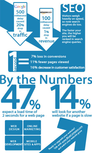
5 Ways to Really Speed-Up Your Page Load Times

It’s been known for quite a while now that one of the factors Google uses to rank websites is page load time. Faster loading pages will generally rank higher than pages that load slowly, provided other factors like content and a crawlable site are the same.

Fast loading pages aren’t important for just web rankings – if a page is loading slowly or times out, how many will hang around to wait for the page to load?

Whatever the reason for a slow loading page – antiquated server, extra coding, improperly formatted images – having one (…or several) will certainly cause you to lose visitors and more importantly, customers. To see how important this is to the average web user, check out this page load graphic courtesy of Blue Compass Interactive and our friends at Planet Ocean.


So how can I speed up my page’s load time? And what’s the recommended page load time for both search engines and web users?

For the best results, it’s recommended all pages on your website load within three seconds.

If your pages are taking longer to load, the following 5 tips will help optimize page load time and ensure your rankings (…and customers) will not slip by the way side due to slow loading pages.

1. Use an image editing program that provides a “Save for Web” setting

Images are by their very nature pretty big. If your webpage is loading images as-is it can dramatically lower your page load time. A “Save for Web” setting will export your image in a compressed file size. Also, don’t forget to specify the original file size in your HTML code (i.e. 500 pixels x 300 pixels). Not specifying these dimensions means your web browser will have to work harder to display the image, thus increasing page load time dramatically.

2. Keep HTML coding to a minimum

Many webmasters, perhaps you, use WYSIWYG (…what you see is what you get) type HTML editors. These programs though add a lot of unnecessary code to your page and thus, slow page load time down tremendously. Examples of unnecessary coding include “comment” lines and “date stamps” to name a few. One program you can use to compress your coding is the GZip HTML Compression tool.

3. Consolidate Cascading Stylesheets (CSS) and JavaScript

These days, every page has at least one cascading stylesheet (CSS), third-party application or JavaScript file to load before the page will function properly. This can slow even the smallest of web pages. Therefore, it’s best to force the browser to fetch as little external information as possible. Consolidate your CSS sheets down to one if possible and embed them at the HEAD of the individual page.

4. Control how your site content is ‘cached’

Demarking and controlling how your site’s content is cached by the search engines will dramatically speed up your page load time. How you do this depends on the type of server you’re hosting your site on.

For an Apache server, you can physically adjust the “Expires” or “Cache control” header attributes. The process for a Windows server is similar and involves manipulation of the HTTP ‘client cache’ element. And if your site is hosted through WordPress, download and install the WP Super Cache plug-in which serves up static HTML pages to the majority of your audience and dramatically boosts page load time.

5. Reduce the amount of cookies

Consider downloading and installing a free ad-on like View Cookies for Mozilla Firefox to monitor the amount of cookies being exchanged between you and your site’s visitors. Review these cookies and see which ones you can reduce in size or eliminate altogether. If you can’t recognize the cookie, then you probably don’t need it. The fewer cookies your page has, the faster it will load.

As we always say, one ranking factor alone won’t determine the success or failure of your site in the search engines. With that said, on-site technical improvements are a sound way to securing long-term rankings. Therefore, if you find your site’s load time is a bit lagging, make sure you pay close attention to the above metrics.

Images vs. Copy – Finding the Right Balance

Recently, I had the pleasure of watching an hour long webinar on images and copy on a webpage. The presentation was by our friends at Marketing Experiments.

And while this webinar is a little old now (originally airing in November), it contains some great commentary on how web marketers can approach and find the right balance between images and copy on their webpages.

Perhaps the biggest take-away I got from the webinar was this – “People don’t buy from websites, they buy from people”

This is perhaps one of the most insightful comments on web marketing I’ve ever heard and will do my best to remember it going forward. But for now, let me give you a quick review of the presentation and invite you to take an hour to watch it yourself – you certainly won’t come away disappointed.

Starting out, Marketing Experiments director Dr. Flint McGlaughlin explained how a lot of things common to websites pose impediments to conversions. Perhaps you know what he’s talking about here – many websites contain or don’t contain elements that prevent you from getting the maximum amount of conversions.

That’s where the Principle of Congruence comes in, which requires every element of a page state or support your page’s value proposition.

Say your value proposition is custom-made products shipped fast – do all of the elements of your page work to support this value proposition?

Images or Copy – Which do I focus on more?

When approaching this question, you need to ask yourself what communicates value more effectively – images or copy – according to Flint and the researchers at MECLABS.

The effectiveness of any webpage element to communicate the value proposition can be measured by the following two capabilities:

1.       Ability to communicate value with force

2.       Ability to communicate value with precision

When considering images and copy, keep in mind that images have a greater potential to communicate value with force and copy has greater potential to communicate value with precision.

Images

The force of an image is directly related to three things:

1.       Relevance – an image’s force increases as the connection between the image and perceived value becomes clearer. Images are great for communicating brand.

2.       Reality – an image’s force increases with its authenticity. Images can reduce the distance between the actual value and the reader’s perception of that value (see example in slide #23).

3.       Relative Weight – an image’s force increases as its relative graphical proportion increases…or in layman’s terms, images that look different than other elements on a page get your attention. This naturally draws the reader’s eye-path. Therefore, if the image provides proper relevance and reality, it will bring more force to bear on the inherit value.

Copy

In short, copy has two distinct advantages over images.

First of all, copy has the ability to include specific, quantifiable detail to your webpage. Secondly, copy gives your site personality and has the ability to include a tone that matches your visitors’ motivations.

Of course, there’s a right way and wrong way to use copy. You don’t want to use phrases that make you seem arrogant – examples include “Your Hunt is Over” and so on.

Also, be careful about your call-to-action copy. In their example (slide #30), a form has an intimidating tone that seems to imply that you will receive incessant phone calls from sales people once you complete it.

What about SEO?

Last but not least, Dr. Flint and the team at MECLABS explored the impacts all of this has on search engine optimization. How do you balance landing page optimization (LPO) with SEO?

In a sense, SEO is a secondary concern. You first need to work on maximizing conversions and then worry about boosting search rankings afterwards. There are many examples of high-ranking pages that fail to convert because the site owner focused solely on SEO, which according to Dr. Flint is just a channel to get people to your page. In other words, it’s a means to an end, not the end itself.

They outlined some questions to consider when identifying the proper balance between SEO and LPO:

1.       Where does your traffic come from? If it’s organic, how well does it convert visitors into customers?

2.       What are your needs in terms of LPO and what’s its potential impact? Are the needs radical or minor? How much will these changes affect your bottom line?

3.       What contributes the most to your SEO ranking – content or authority?

4.       Can you measure the impact of page changes?

After discussing some ways to identify the proper SEO/LPO balance, Dr. Flint and the team evaluated a couple of sites given to them by one of the webinar’s original participants and offered tips on how to strike the right balance between images and copy to maximize conversions.

In the end, the webinar is well worth the one-hour it takes to watch it and take some notes. I’m sure I’m leaving something out since it was so extensive and informative. Watch the video or tell us about your experiences in using images and copy and how well your balance worked to increase conversions.

Click image to see video presentation

Click image to see video presentation

Or listen to an audio version here.

Until next time…